
A Beginner's Guide to Understanding Colour Theory in Interior Design
Colour is the first thing you notice when you walk into a room, and usually the last thing you can explain. Before you register the sofa, the lamp or the floorboards, your eyes have already decided whether the space feels calm or restless, generous or tight. That decision is not down to luck, and it is not down to having "an eye". It comes from a handful of relationships between colours that you can learn in an afternoon.
Here is how those relationships work, and how to use them without turning your sitting room into a colour-wheel exercise.
Start With the Colour Wheel
The traditional artist's colour wheel is a circle of twelve hues. Three primaries — red, blue and yellow — sit evenly around it. Between them are the secondaries you get by mixing two primaries: green, orange and violet. Between those sit six tertiaries, such as blue-green or red-orange. That is the whole structure. You do not need to memorise it; you need to understand it as a map of relationships. Colours sitting near each other get along. Colours opposite each other argue, productively.
Hue, value and saturation
Before choosing a scheme, it helps to know what people actually mean when they describe a colour. Hue is the colour itself — green, blue, pink. Value is how light or dark it is: a pale sky blue and a midnight navy share a hue but behave completely differently on a wall. Saturation, sometimes called chroma, is how pure or muted the colour is. A dusty sage and a bright emerald can sit close together on the wheel and still feel like different worlds.
This is why "I like green" is not quite enough information. Which green, how pale, and how greyed-down?
Complementary Schemes: Maximum Contrast
Complementary colours sit directly opposite each other: red and green, blue and orange, yellow and violet. Used well, they create energy and definition. A deep navy room with burnt-orange cushions feels confident and deliberate. The same navy with an orange sofa, orange rug and orange curtains feels like a shouting match.
The rule of thumb is to let one colour lead and keep its opposite as an accent. If you want something softer, try a split-complementary scheme — one colour paired with the two hues either side of its opposite. Blue with red-orange and yellow-orange is far gentler than blue with straight orange, and still reads as intentional.
Analogous Schemes: The Quiet Ones
Analogous colours are neighbours on the wheel: blue, blue-green and green; or terracotta, rust and soft pink. These palettes are naturally harmonious and hard to get wrong, which makes them a sensible starting point if you are nervous about committing.
The trap is flatness. Three closely related mid-tones can blur into one muddy field. Fix it with contrast in value rather than hue — a very pale wall, a mid-tone upholstery, a dark wood or near-black accent — and layer in texture through wool, linen, ceramic and rattan so the eye has something to do.
The 60-30-10 Rule
Proportion matters as much as palette. A useful guideline worth keeping in your head splits a room roughly like this:
- 60 per cent — the dominant colour: walls, ceiling and any large floor covering. You will live with this one daily, so choose something you genuinely like rather than merely find inoffensive.
- 30 per cent — the secondary colour: sofa, curtains, cabinetry, a large rug. It should support the dominant colour, not compete with it.
- 10 per cent — the accent: cushions, artwork, a lamp base, a vase. This is where personality goes, and it is the cheapest layer to change when you tire of it.
Neutrals count towards these proportions. Cream walls, an oatmeal sofa and black-framed prints are still using the formula. And when a scheme feels wrong, the 10 per cent is almost always the place to adjust first.
Light, Undertones and Why Testers Lie
No colour exists in isolation. A north-facing room in Britain receives cool, faintly blue light for much of the day; a south-facing one is warmer and brighter. The same soft grey can look elegant in one and chilly in the other. Warm undertones — yellow, red, pink — soften a cold room. Cool undertones — blue, green, slate — calm a very bright one.
Two other things catch people out. Paint looks more intense over a large area than on a small patch, so a shade that seems subtle on a tester card may feel much stronger across a whole wall. And bulbs matter: the same wall shifts noticeably between daylight and a warm lamp in the evening.
So test properly. Paint two coats onto A3 sheets, or straight onto the wall, and leave them for at least three days. Look at them in the morning, in the afternoon, and under the lamps you actually use. Hold each against a sheet of plain white paper to judge the undertone honestly.
Building a Scheme in Five Steps
- Start with an anchor you already love — a rug, a painting, a length of fabric, even a favourite jumper.
- Pull two or three colours out of it and ignore the rest.
- Choose one as the dominant, one as the secondary, and keep the third for accents.
- Add a neutral, usually a warm off-white or soft stone, to give the eye somewhere to rest.
- Check the proportions with samples in the room before you commit to paint.
Where to Start This Weekend
Pick one room and start with the largest surface: the walls. Decide whether you want calm or contrast, then choose the scheme to match — analogous if you want quiet, one complementary accent if you want a lift. Buy two sample pots, not five. Paint them up, live with them for a few days, and notice which one you stop seeing. That is usually the right one.
Colour theory gives you a structure, not a verdict. Once you understand why a palette works, you can break the rules deliberately rather than by accident — and that is when a room starts to feel like yours.
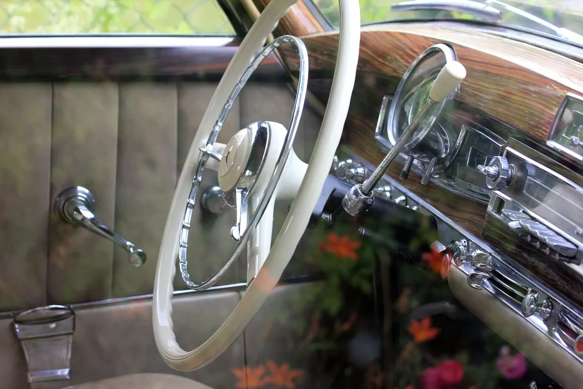
Photo: Nicolas-Debray / Pixabay